
What People Around the World Do in a Day: A Data-Driven Look at Daily Routines
Comparing how people spend their time across different countries


Introduction
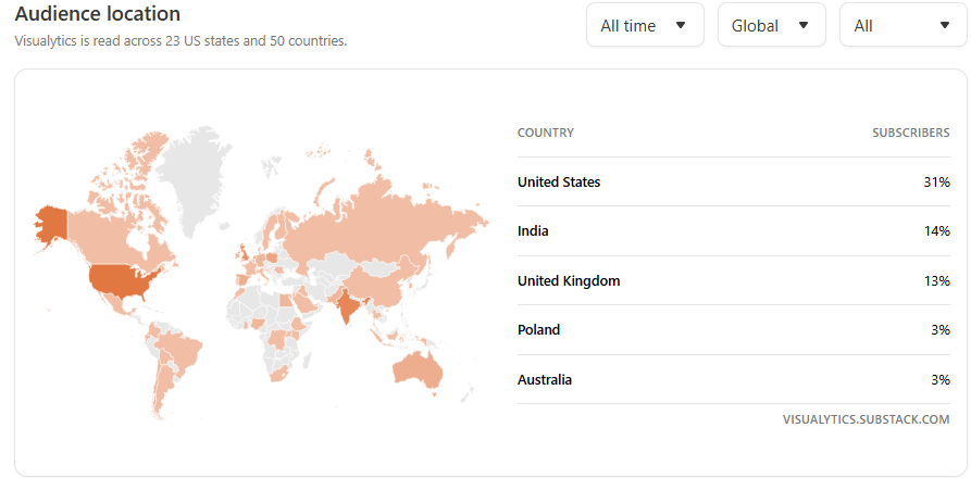
Visualytics is an international community! 🌎 You are part of a community of avid readers from over 50 countries! Now we know that every single one of us has the same 24 hours in a day, but how do we actually spend our time each day? Not in the aspirational sense, aka how we should spend our time according to Substack productivity gurus, but in the ordinary, lived reality of our daily routines.
How much do we work? How long do we sleep? Who has the most free time? Does this vary depending on where you’re reading this from?
In this post, I dug into the latest data from the OECD Time Use Database, which tracks how people across many different countries allocate their time in a typical 24-hour day. The results offer a very interesting glimpse into the rhythms of daily life across the world.
Let’s take a look at what the data has to say! But first, check out the map below for a quick glance of who are your fellow Visualytics aficionados. A BIG thank you to all of you!
Methodology
As stated above, I used data from the OECD Time Use Database, which offers daily averages for how individuals across 33 countries from ages 15-64 spend their time. The dataset groups activities into broad categories and sub-categories, and for clarity, I focused on the main ones that account for the majority of each day:
Paid Work or Study: Jobs, school time, homework, commuting
Unpaid Work: Household chores, grocery shopping, childcare, caregiving, volunteering
Personal Care: Sleeping, eating & drinking, hygiene, medical appointments including related travel for personal care
Leisure: Watching TV, playing sports, attending events, socializing, and other downtime activities (uncategorized)
Other: Religious and civic activities, as well as a small “other” uncategorized bucket
Some categories had sub-categories that were so small they barely registered a meaningful data point. For instance, job searching, averaged just 11 minutes per day across all countries. Therefore in this post, I chose to work with the top-level categories to keep the focus on broader behavioral patterns.
Lastly, the data reflects average minutes per day, which includes both people who engage in an activity and those who don’t. So when you see, say, 240 minutes of “Paid Work” in one country and 180 in another, that’s an average across the entire population, not just those with jobs or that are in college.
Results and Key Insights
The interactive map below offers a quick overview of how people around the world divide their time across five major activity categories: Paid Work or Study, Unpaid Work, Personal Care, Leisure, and Other. Can you find your country in the map?
For reference, I’m located in the US, so my numbers, according to this data, look something like this:
💻Paid Work: 280 mins, roughly 4.6 hours!! (oh boy, if only…)
🧹Unpaid Work: 187 mins, roughly 3 hours
🛌Personal Care: 637 mins, roughly 10.6 hours (but take into account this also includes sleeping)
😺Leisure: 279 mins, which is about the same as Paid Work (honestly, I wouldn’t hate this)
⛪Other: 34 mins
But daily life is more nuanced than broad categories can express. That’s where the table below comes in. The interactive table below breaks down each category into its key subcomponents: from hours spent doing chores, or commuting, to time dedicated to volunteering, socializing, or simply chill watching TV.
Here are a few takeaways that emerge from the data:
Data trends are consistent throughout all countries: In general, everyone goes to work, does chores, sleeps, eats, and then maybe has some time for some leisure activities (usually watching TV). The consistency in how time is divided shows that, globally, the structure of a day isn’t all that different no matter where you are.
Some work to live, others live to work. Countries like Japan, Mexico, and China report the highest time spent on paid work or study. Meanwhile, countries like Italy, France, and Spain, spend noticeably less time on paid work. This suggests a cultural trend across Europe where life is more than just going to work.
Unpaid labor is invisible but essential. Routine housework and caregiving can add up to a significant chunk of the day, especially in countries like Mexico, Slovenia, and Lithuania. This category just shows how much the world runs on work that isn’t formally paid or tracked, but a great reminder that the value of a person’s time doesn’t always show up in economic indicators but definitely show up in our day-to-day lives.
Sleep is sacred, for the most part. While most countries average the recommended 8 hours of sleep, there are some outliers like South Korea and Japan that report about 1 hour less of sleep, this can be especially problematic for countries with high working hours like Japan. Nevertheless, the fact that his number is very high is a positive trend on a world that sometimes needs a much-needed pause and moment of peace.
Conclusion
Probably what struck me the most from this dataset was how similar the routines of daily life are across countries. I was honestly expecting to see more diversity reflecting cultural differences and outliers, we saw some glimpse of this with the Western European low working paid hours. However, a part of me feels that this doesn’t reflect an accurate picture. Personally, I feel like we live in a very busy and chaotic world filled with long working hours and long unpaid responsibilities where time to relax is becoming scarcer. But maybe that has been just my experience, and this reflects a personal bias. Or maybe that’s just modern life as an adult.
What did you think? I’m curious to hear what you have to say about this topic, do you think the data visualized paints an accurate picture of your routine and your experiences? Or do you think it misses something deeper?
Also, do you think we’ll see some drastic changes to this snapshot as the economic and technologic landscape change in the upcoming years?
Let me know in the comments below and don’t forget to subscribe for more data-driven stories, visual explorations, and fun facts analyses!
As always…
Thanks for reading! ✌️
In your last article, I said I'll move to cluster 0, specifically Doha. Now it's France or Spain. LOL