
Do Cities Have Data Personality Vibes? Clustering Cities Using K-Means
A Beginner's Guide to Unsupervised Machine Learning


I know it’s been a while and I haven’t been posting as much as I would’ve liked to, so first and foremost a BIG THANK YOU to everyone that has kept around and is reading this post! Your support means a lot to me, and I look forward to continuing producing quality content for all of you! Without further ado, let’s dive into this week’s visual story: Understanding city vibes through unsupervised machine learning.
While LLMs, AI agents, and vibe coding are dominating today's tech headlines, the foundational elements of machine learning: supervised and unsupervised learning, remain incredibly valuable techniques to master. These "old school" ML approaches may not generate the same buzz as ChatGPT or AI assistants, but they provide the analytical backbone that powers countless real-world applications such as Netflix recommendations algorithms or Amazon’s customer segmentation systems.
Unlike generative AI which sometimes feels like magic, traditional ML techniques give you transparent, interpretable results with clear statistical foundations. I think learning these fundamental approaches are not only extremely beneficial to build critical thinking skills for data analysts but also provide some of the backbone needed to understand how more complex AI systems function under the hood.
In short, learning these techniques can be thought about as understanding grammar before writing the next great American novel with more advanced AI applications.
What is Unsupervised Learning?
A few years ago, when people thought about machine learning, they often pictured a model being "taught" with examples (labels) showing it thousands of images of different subjects (i.e. cats and dogs), so it can learn to tell them apart. That's called supervised learning, where the model learns from labeled data.
But what happens when there are no labels and you’re just working with raw data?
That's where unsupervised learning comes in.
In unsupervised learning, the goal is to let the algorithm find hidden patterns, groupings, or structures in the data without being explicitly told what to look for. The model isn't "right" or "wrong" in the traditional sense, it's simply trying to make sense of the information based on similarities and differences it detects.
A classic use of unsupervised learning is clustering: a technique where data points are grouped together because they share common traits. Instead of telling the algorithm, "These are cities with high pollution" or "These are affordable places to live," we give it a range of indicators and let it figure out which cities naturally resemble one another.
Unsupervised methods like clustering are powerful because they can help reveal trends that are not immediately obvious for an analyst showing connections we might not have thought to look for.
In this post, I’ll be using clustering to explore a simple but interesting question:
Do cities have distinct “vibes”?
For reference, here’s the list of cities that I included as part of my analysis:
cities = [
    "New York", "Los Angeles", "Chicago", "Dallas", "Toronto", "Vancouver",
    "London", "Paris", "Berlin", "Amsterdam", "Madrid",
    "Rome", "Barcelona", "Lisbon", "Stockholm", "Copenhagen",
    "Tokyo", "Osaka", "Seoul", "Beijing", "Shanghai",
    "Bangkok", "Singapore", "Jakarta", "Manila",
    "Mumbai", "Delhi", "Bangalore", "Dubai", "Doha",
    "Istanbul", "Moscow", "Cape Town", "Johannesburg", "Lagos",
    "Nairobi", "Buenos Aires", "Sao Paulo", "Rio De Janeiro", "Santiago",
    "Mexico City", "Bogota", "Lima", "Caracas", "Havana",
    "Sydney", "Melbourne", "Auckland", "Tel Aviv", "Cairo"
]
I chose these cities primarily due to the abundance of data available about them. However, I do think this list does a good job at providing a wide geographical variety covering multiple continents as well and providing a decent variety of size and economic density.
How Did I Measure a City’s Vibe?
Vibes are always subjective; however, I wanted to take a stab at categorizing them through data points. To capture the feeling and character of different cities across the globe, I gathered a mix of features that touch on safety, cost of living, environment, and everyday experiences (such as purchasing power).
Here’s a brief description of the features I chose for this analysis:
Crime Index1: A measure of how safe or dangerous a city feels.
Quality of Life Index: A broad score factoring in everything from healthcare quality to climate.
Traffic Index: Reflects the congestion and commuting experience.
Pollution Index: Captures air quality and general environmental cleanliness.
Green Space per Capita2: Average share of urban areas allocated to open public spaces.
Green Space Easily Accessible per Capita: Average share of urban population with easy access to parks and open spaces (within 400m walking distance)
Cost of Living and Purchasing Power: Including the sub features such as rent prices, groceries, restaurant costs, and local purchasing power, relative to New York City as a baseline.
By taking these features into account as a blend of lifestyle factors, environmental comfort, and economic accessibility, I built a multidimensional "vibe profile" for each of the 50 cities in the analysis.
Clustering Analysis Through K-Means
Once I gathered all the data, the next step was to actually use Machine Learning to find patterns and groupings of cities that may share a similar “vibe” based on their urban, green, and economic characteristics.
To do this, I used K-Means Clustering, one of the most popular and widely used techniques in unsupervised machine learning.
K-Means works by trying to group data points (in this case, cities) into a pre-specified number of clusters based on their feature similarities. It does this by minimizing the distance between each city and the center (or "centroid") of its assigned cluster.
The result? In theory, those cities that end up in the same cluster are statistically more similar to each other than to cities in other clusters, even if they’re located in completely different parts of the world!
Before running the algorithm, I made sure to standardize the data. Since some of the features were measured on different scales, it was important to normalize them so no single feature would dominate the clustering process. In general, this is a pretty standard step to follow. Then, I used the elbow method to help determine what is the best number of clusters.
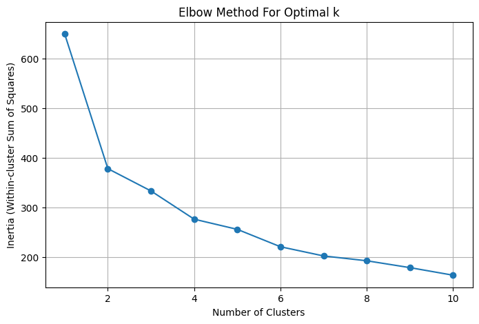
The Elbow Method
The elbow method helps determine the optimal number of clusters by plotting inertia (the total distance between each data point and its cluster’s center) against the number of clusters.
As the number of clusters increases, inertia goes down, because more clusters mean cities are closer to their centers. But at a certain point, adding more clusters doesn’t make much of a difference, and the inertia decreases more slowly. At this point you have the so-called "elbow". The point where the decrease slows down is usually the best number of clusters.
In my analysis, I noticed that inertia dropped quickly at first but then it slowed down after around 4 clusters. This suggested that around 4 clusters would be the most meaningful and balanced choice as you can see from the plot below.
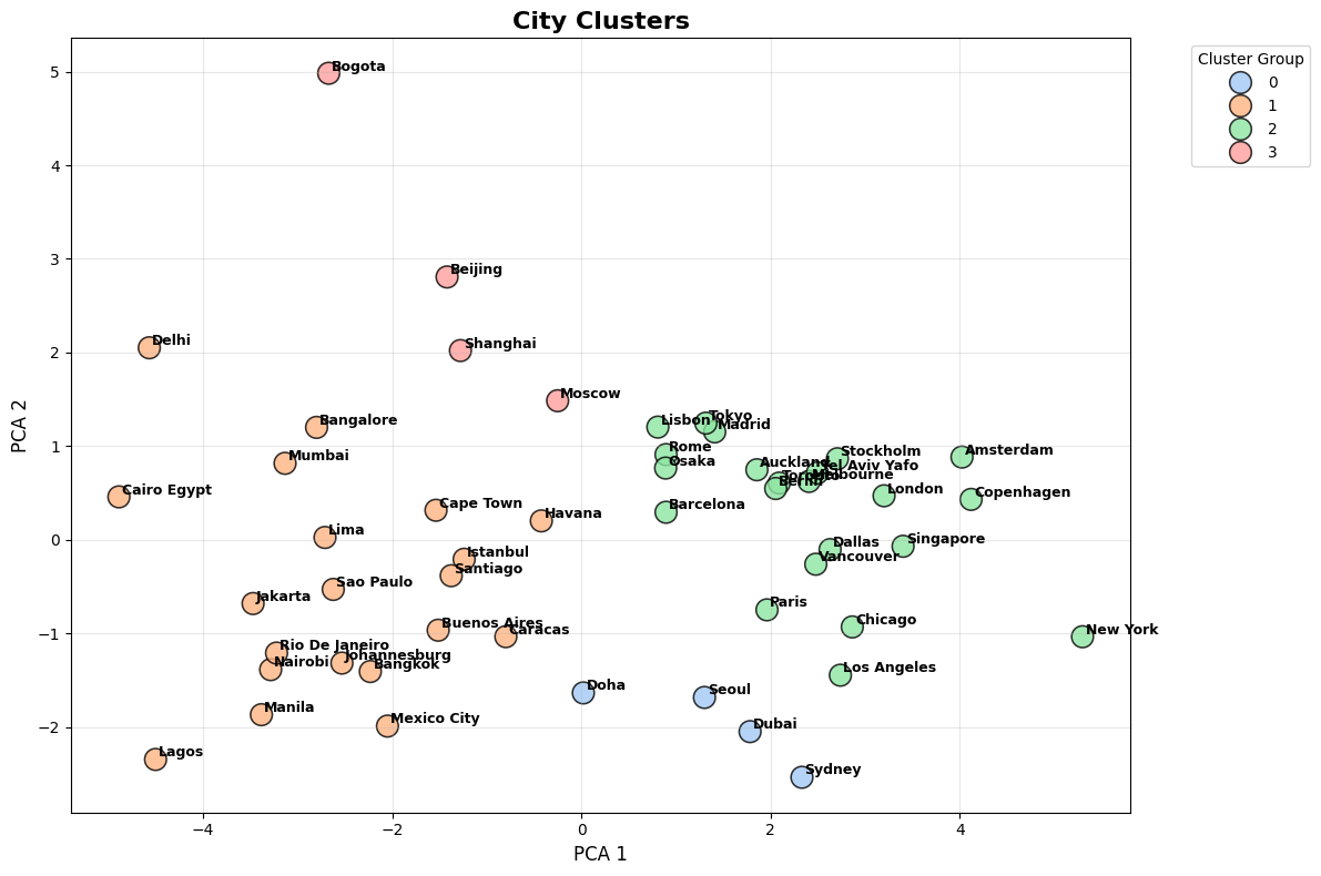
Principal Component Analysis (PCA)
While K-Means grouped the cities into clusters, Principal Component Analysis (PCA) helped me visualize those clusters more easily. PCA is a technique that reduces the number of dimensions in the data (in this case, all the features we’re using to measure a city’s vibe) while keeping the most important information. It turns the data into a new set of variables called principal components, which show the main differences between cities.
In other words, I used PCA to reduce the data from 12 dimensions to just 2 components, allowing me to easily display this information in a scatter plot. In this plot, each point represents a city, and cities in the same cluster are color-coded. The plot helps show how the cities are spread out based on their most important characteristics.
While the clusters generally looked good, there was some overlap between them on the plot. This happens because PCA focuses on capturing the most important patterns, but there might still be smaller, more subtle relationships between some cities that aren’t fully captured. The overlap doesn’t mean the clusters are wrong, but it shows that some cities have similar vibes, even if they belong to different clusters.
What About the Vibes?
Ok so far, we’ve learned about how to choose our number of clusters and dimensionality reduction, but what insights can we actually drive from this analysis? In other words, what are the vibes?! Well, let’s take a look below.
Cluster 0: "Global Powers vibe"
Cities in this cluster tend to have a good balance of green spaces, the lowest crime index, and high traffic. They are peaceful urban centers with a higher average share of open spaces for public use, making them attractive for residents who prioritize nature; however, these cities maintain high costs of living while providing residents strong economic capability.
Cluster 1: “Gritty but Affordable vibe”
Life in these cities is vibrant but comes with its fair share of challenges. While the cost of living and rent are among the lowest, residents face higher crime rates, heavy traffic, and more pollution. Green spaces are also less accessible.
Cluster 2: "Premium Urban vibe"
Cities in this cluster have a strong combination of high-quality living, premium real estate, and excellent accessibility to open spaces. Think of them as an improved version of Cluster 0. These cities are not only economically well-off but also offer sustainability and significant green spaces and efficient public access to nature. They might be more expensive but offer residents an exceptional quality of life, high income potential, and a relatively clean and peaceful environment.
Cluster 3: "The Mixed vibe"
Cities in this group show a more balanced blend of affordability and quality of life. They provide a mix of open spaces, moderate crime levels, and a relatively healthy environment. However, if you paid close attention to the plots above, it’s actually a little hard to determine an accurate ‘vibe’ for this cluster due to the small sample of cities that make up this cluster (4 cities).
Below you can the mean values for each feature on each cluster as well as a bar plot that shows how each cluster ranks.
Conclusion
Exploring the “vibes” of cities using unsupervised machine learning has given us a fresh lens and a practical application for some extremely useful tools during the Exploratory Data Analysis phase of every analyst. By leveraging K-Means clustering and PCA, we were able to categorize cities based on different features like quality of life, cost of living, safety, and access to green spaces leading to distinct groupings that highlight both the similarities and the differences between cities.
We were able to discover some, perhaps obvious, relationships peeking into the different “vibes” that urban areas can offer. Some cities, like those in the "Premium Urban vibe" cluster, offer a perfect balance of high-quality living with lots of open spaces, while others, like those in the “Gritty but Affordable vibe,” might not have the same environmental perks but compensate with low costs.
But as with any data analysis, these clusters only scratch the surface, if anything this post was also helpful in demonstrating that there’s no “one-size fits all” approach as evidenced by the fact that Cluster 3 only had 4 cities on it. Results like this should encourage different experimentation with respect to the numbers of clusters (remember your elbows!)
Additionally, there’s so much more beneath the surface to uncover! Especially when you start factoring in additional elements like the local culture (such as number of museums) or perhaps a food index or an intangible aspect that make a city unique such as a courteous or politeness index.
That’s it for this post however, but I want to learn your thoughts on the matter.
What are the aspects of a city’s vibe that matter most to you? Do you live in one of the cities that I analyzed? Or do you agree with what the data had to say about it?
Let's keep exploring the world of data together!
Thanks for reading! ✌️
Crime, Pollution, Traffic, QoL, and CoL data was obtained from Numbeo, a platform dedicated to crowdsourcing up-to-date information and data accessible to everyone.
Green Space Data was obtained from the United Nations Habitat - Urban Indicators database
Fascinating read! I was surprised to see Singapore show up right between European and US cities in the scatter plot.
Interesting that Doha and Sydney are in the same cluster. They would have never crossed my mind as being "similar" :)