
How-To Make a Sankey Diagram Using Flourish
A Beginner-Friendly Guide, little to no coding required.

What is Flourish?
Flourish1 is one of the best tools I’ve found recently! The funny thing is that I didn’t even know they were owned by another platform I’ve used in the past to make some of my content (Canva). For those that don’t know it, Flourish is a data visualization platform that makes highly engaging, interactive, and overall pretty visualizations. The best part is that there’s not a whole lot of technical skills required, and they have a ton of templates readily available for their users.
Sankey Diagrams
Before we start, let’s begin by defining what Sankey diagrams are and some potential applications. Sankey diagrams are flow diagrams that represent the flow of resources, values, quantities, cost breakdowns, etc. They emphasize the major transfers or flows within a system and are often used in science, finance, or physics to show energy inputs and outputs.
Fun Fact: They were invented by Captain Matthew Henry Phineas Riall Sankey, who used it for the very first time to visually describe the energy efficiency of a steam engine, back in 1898.

Why Use a Sankey Diagram?
Well, they were created to illustrate the flow and energy balance of a system, so that’s one of the most common uses given to these diagrams; however, an advantage of this data visualization tool is that they can be used to highlight the biggest and most influential entries in a system.
As such, another practical application of these diagrams can be to show how values move between interconnected components or even show some patterns, trends, and relationships between multiple entities. As with many things data related, the limitations depend on the data analyst.
For the purposes of this post, I will be illustrating 2 cases of real-world applications of Sankey diagrams: a list of UEFA Champions League Winners and a list of FIFA World Cup Winners. One key takeaway is that these diagrams are robust enough to be a useful tool outside the STEM fields.
I think these 2 cases do a good job at highlighting some of the pros and cons of Flourish as you will see by the end of this guide.
How to Make a Sankey Diagram in Flourish
I will not be providing instructions on how to set-up an account as that process is pretty straightforward. Additionally, instead of giving you a step-by-step guide, I will be highlighting the important concepts and things to take into account to make sure your diagram is displayed nicely.
Data Gathering
I will be using Wikipedia as my source and the nice thing is that if you already subscribe to my content, you already have a really great tutorial on how to grab tabular data from Wikipedia:

For this guide I will be using the following sites:
You want to have your data in long format, in other words, you have to make sure your data has one row per record. Flourish will internally aggregate these rows and adjust the graph accordingly.
Tip: I used Python to manipulate my data into the format I wanted, but you can use any tool you like Excel or Google Sheets.
Navigating Flourish
Now that you have your data, you’re ready to the fun part, making your own diagram!
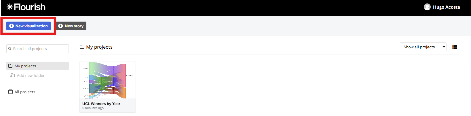
First thing you want to do is head to your Projects area. Then, click the New visualization button.
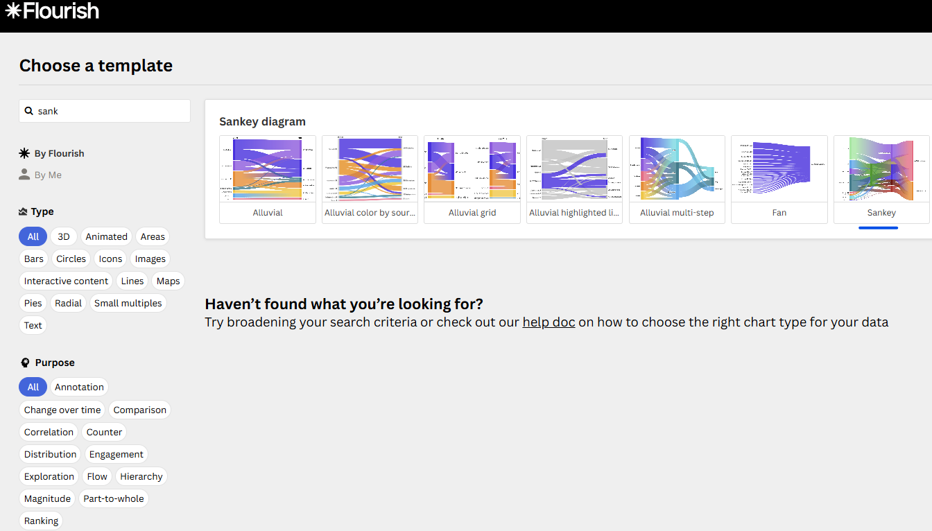
Next, start typing “Sankey” in the search bar until you find the Sankey diagram
This will take you to the Preview area, but we are interested in the Data tab. The Data tab will look like a spreadsheet, where you will enter the data you captured earlier. A nice feature that Flourish offers is that they provide a sample dataset for you to test out their capabilities, so if you prefer to user that dataset instead, you can still make your very first Sankey diagram using that dataset.
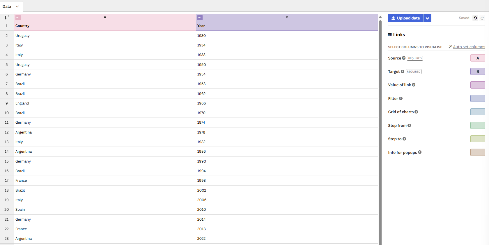
As we discussed earlier, Sankey diagrams are flow diagrams, therefore, you are required to enter a column for your Source and a Column for your Target. This is why I highlighted the importance of long format data, the data that I used could’ve been grouped by winners, the way it’s shown on the Wikipedia article, but for a Sankey diagram it’s preferable to have one entry per row.
Customizing Your Diagram
Now that your data has been loaded, head back to the Preview tab.
The right-hand menu has a ton of options that you can use to adjust your diagram to your needs such as labels positioning, animation, color scheme, sorting order of your data, etc.
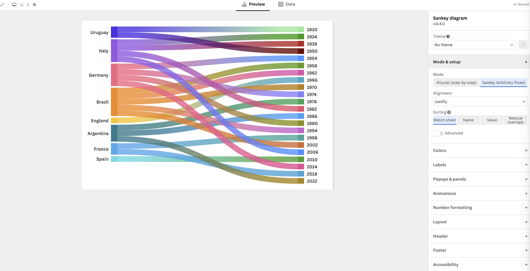
Here are my must-do customizations:
Theme - Select one of the pre-built Flourish themes or create your own (this requires a paid subscription however)
Sorting - Make sure you select the Match Sheet option if you want the data to be displayed the same way you prepped it.
Palette - It’s easy to confuse a palette with a theme, but Flourish allows you to select different palettes or create your own for free. This palette represents how the bars are displayed in your diagram.
Title - You wouldn’t present a chart without a meaningful title, would you?
Footer - This is a great place to cite your data and also include a link to your portfolio, Substack page, GitHub, etc.
After editing these fields, I ended up with these charts:
Analyze Your Results
As stated earlier, I think these two charts do a great job at highlighting the pros and cons of these diagrams. It boils down to the number of categories or entries you might have, it can become problematic to get insights if your chart gets too cluttered.
Key Insights
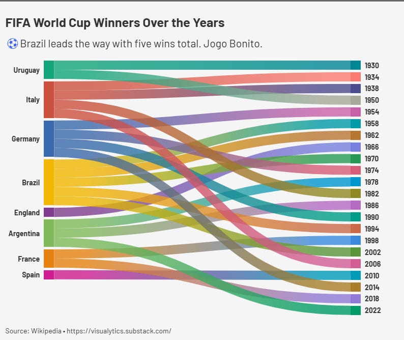
FIFA World Cup Winners (a great example)
You have a very clear understanding of what the data is trying to show: Brazil, Germany, and Italy’s dominance over the World Cup
Outliers such as England or Spain stand out clearly
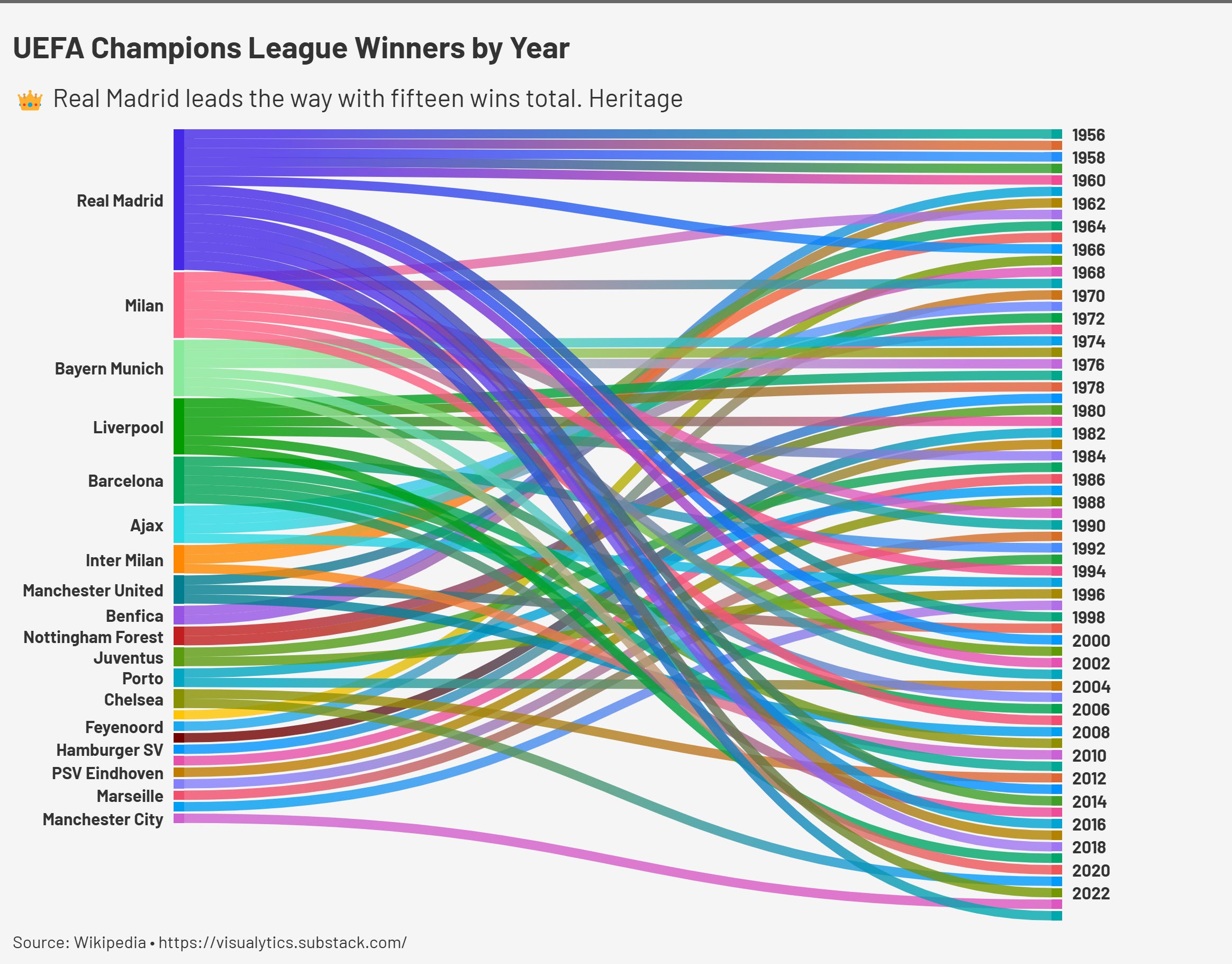
UEFA Champions League Winners (a not-so-great example)
You start losing some insights, such as the lack of clarity of who won the most recent UCL (Real Madrid).
I find it pretty annoying that the year 2024 was cut off from the chart despite the “Year” data being displayed in increments of two.
You can clearly see Real Madrid’s dominance (despite the 2024-win oversight), but it becomes increasingly harder to get meaningful data out of other historic teams such as AC Milan or Bayern Munich.
To the benefit of Flourish, I will say that these charts are animated within your Projects area, which means you can click and select categories, which circumvent some of these issues; however, if you export your diagrams as images, be aware of the lessons learned in this post.
Conclusion
In this post you learned that Sankey diagrams are an excellent tool to visualize flows and highlight dominant categories, but we have to be aware that they work best when your dataset is simple and focused.
Additionally, I highly recommend Flourish as it makes it very easy to build and customize diagrams that are appealing and easy to incorporate in your portfolio or Substack publications. I think using Flourish can be very advantageous if you want to focus on the data preparation aspect of your task instead of the visualization aspect.
Did you find this guide helpful? Drop a comment or even better, share your own Sankey diagrams! I’d love to see what you can come up with!
Thanks for reading! ✌

This post is not sponsored by Flourish.
amazing. been trying to use sankey for a personal viz and trying to find workaround with the data structure has been annoying. Do you think this can be helpful in Tableau?